Annotated wireframe

I conducted extensive research on competing credit union sites, consulted with senior management, wrote copy (not just “lorem ipsum” placeholder text), and added extensive notes for this homepage wireframe.

Annotated wireframe

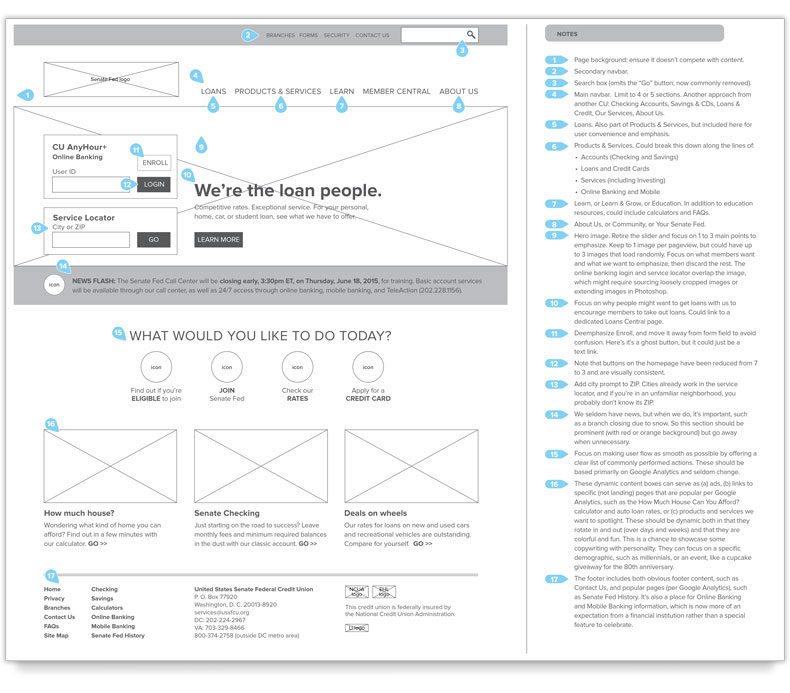
The wireframe includes detailed notes on the right.

Annotated wireframe notes detail

My notes were based on a commitment to focusing on meeting the needs of our members and drew on diverse research.

Annotated wireframe detail

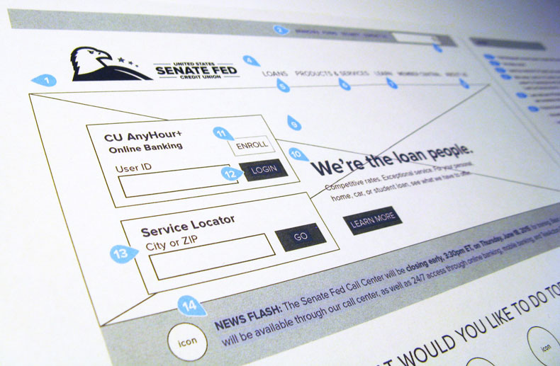
I wrote my own sample copy for the wireframe to give the stakeholders a sense of the true possibilities of the redesign.

  • Challenge With this complete redesign, we needed to improve the user experience, making most the popular sections of site easier to find, and focus users’ attention on the value of our loans—a key goal for the credit union.
  • Solution

    My department (marketing) consulted with the senior management team about credit union's main focus: getting new loans. We did a deep dive into Google Analytics for the site to learn which pages users accessed most frequently from the homepage. I conducted extensive research on competing credit union sites, including the largest 60 credit unions by members and assets, the 10 credit unions closest to ours in assets and size, and the top 10 banks. I compiled a list of how these other financial institutions organized their sites by section to ensure that we would use both the best and most familiar grouping, making the site easily navigable for our members and other users. I also assembled the screen shots of homepages and auto loan pages for these other sites for reference and discussion by the marketing and senior management teams.

    I created an annotated wireframe of the homepage with extensive notes on page sections. After deciding on a proposed “list of ingredients,” I came up with a rough layout, then adapted it to a grid that would work with Bootstrap. Rather than using placeholder text, I wrote copy for each section of the homepage (for example, “We’re the loan people”) to give members of the marketing and senior management team a better sense of how the content might gel on the page. I changed some of the links on the current homepage from buttons to plain text links to focus the users on the most desired actions, reduced the number of buttons from seven to three, and made them uniform in design. In sections including the footer, I grouped items for more logical organization and enhanced usability. Finally, I added space for uniform icons for common tasks (such as Become a Member and Apply for Credit Card).

  • Result The redesign did not take place, but the wireframe gave the credit union a focus for the future.
Back to Portfolio