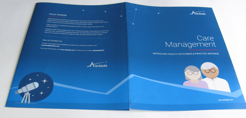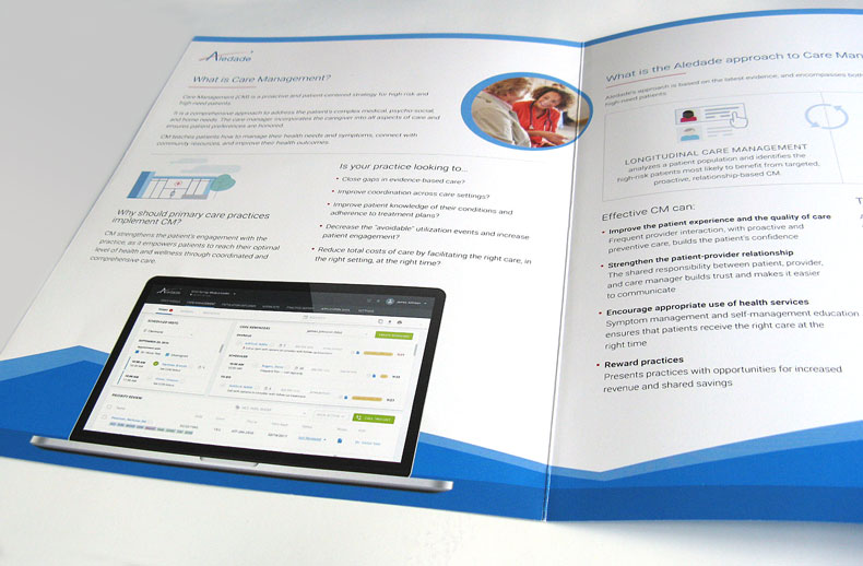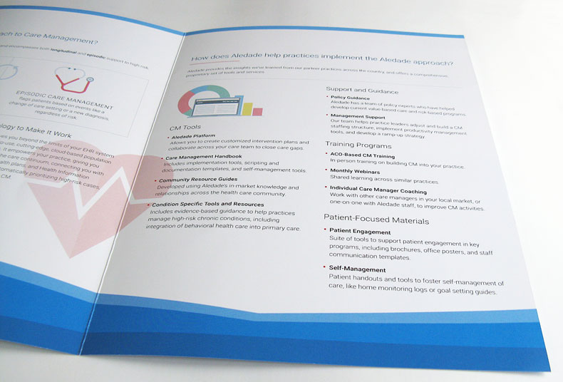
Built on the company’s distinctive illustrations, the brochure introduced a zigzag motif that evokes both bar graphs and mountain ranges.

I standardized and refined this startup’s logo and palette, including outfitting it with a harmonious range of tints and shades of blue.


I also ensured that the colors would print well on an offset press.
