Compliance Tool Branding

This logo serves as the springboard for a brand with a clean look and subtle graphic elements.

Compliance Tool logo

The branding project created a clean visual identity with elements that reflect the satisfaction of adopting this new product.

Compliance Tool flyer

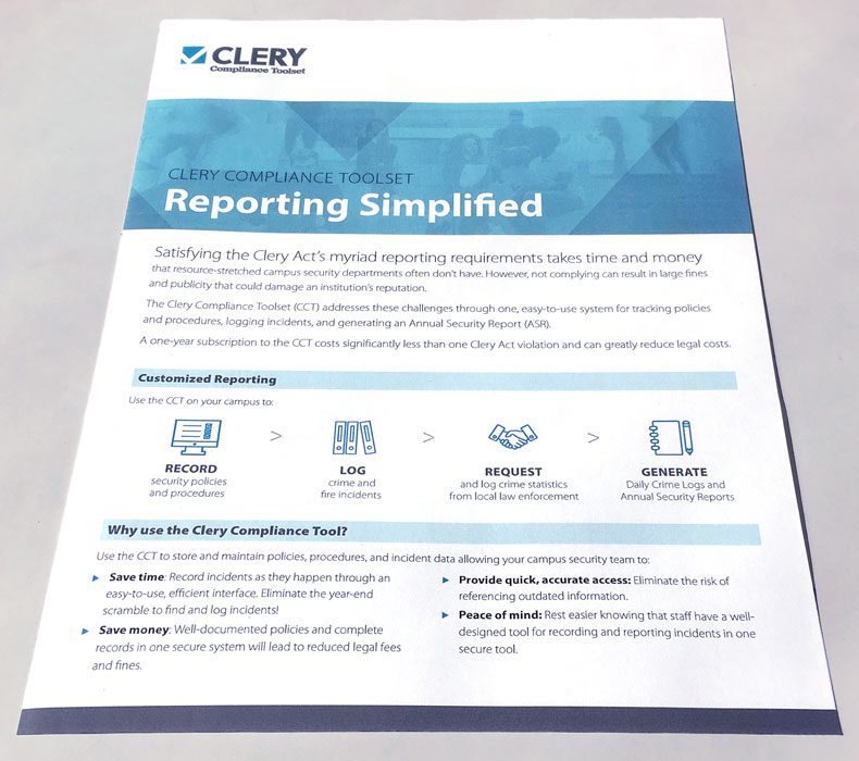
I used the new visual identity in a flyer. The negative space formed by the checkmark creates triangular shapes that work effectively in the overlay on the header image.

Compliance Tool early options

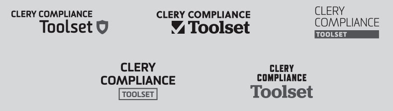
Earlier in the process, I created options in black and white for review by the product team.

Compliance Tool color options

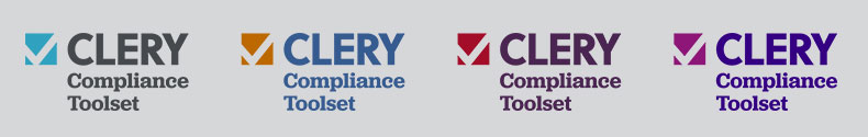
After the team chose one of the options, I collaborated on revisions, refined the logo, and presented palette options.

  • Challenge Create a logo and brand identity that reveal the essence of the product and satisfy the requirements of the executive team.
  • Solution This insurance company was branding a tool that served a vital role: streamlining the mandatory process for reporting campus security incidents and preventing steep fines. Because the product would be new to the audience, the executive in charge wanted a typography-driven logo that emphasized the product’s full name rather than a logomark. I developed a few options with no marks or subtle, simplified marks, including an officer’s shield and a stylized checkbox. The checkbox mark evokes the satisfaction of completing a task, and the negative space it creates forms triangles that serve as design elements. The team loved the logo and quickly adopted it.
  • Result I created the logo, a palette for digital and print, and its public introduction: a flyer incorporating design elements and the palette.
Back to Portfolio