Credit union logo

This dramatic approach to a financial institution’s logo reflects extensive research, communicates a protective nature, and serves as a cornerstone for updating the overall visual identity.

Credit union logo

One advantage of credit unions over banks is their personal touch, so I replaced the silhouette of the eagle, adding facial features and evoking a personality that suggested a vigilant, protective nature.
Credit union logo mockups

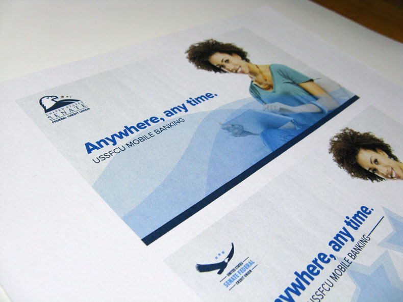
Mockups of earlier iterations of the logo using elements from the logo in the design.
Credit union logo photo

After hearing customer service staff members answer the phone with the to-the-point greeting “Senate Federal,” I suggested emphasizing “Senate Federal” in logotype, then shortening the name from “Federal” to “Fed.”

  • Challenge The stakeholders believed the current logo was stodgy, generic, and confusing. It didn’t scale down well. And it recalled too much the logos of various federal departments. This revision needed to solve those issues and also serve as a cornerstone for a new brand for the credit union—while offering some continuity with the old visual identity by retaining the eagle and the palette.
  • Solution I researched competing credit union logos, compiling the visual identities of the largest 60 credit unions, 10 credit unions closest to ours in members and assets, and top 10 banks. I learned credit union members were familiar and comfortable with more contemporary visual identities. I changed the typeface from the dated Optima (closely associated with beauty products of the ’70s and ’80s) to the more up-to-date humanist sans serif Proxima Nova. I gave the eagle a stylized, streamlined look. I incorporated elements from the old logo (the three stars, eagle, and palette) but made them more dynamic: the stars descend in size and follow the eagle’s eyeline. I flipped the dominant color from brown to navy blue, which suggests stability and trustworthiness. I rotated the eagle’s head to the right to face the type (in the horizontal version) and the web page content. Finally, I created rough mockups of how the logo and related design elements would work on the website, in the branches, and in advertising.
  • Result The logo was approved by the senior management team, and I contributed to its presentation to the board of directors.
Back to Portfolio