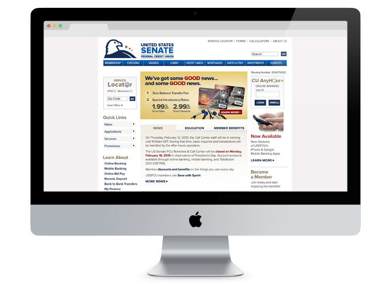
This new design uses the same structure as the earlier design so that it could be implemented without extensive development work.
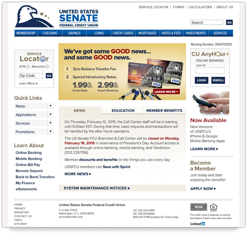
I reduced the number of typefaces to one: the webfont Proxima Nova, also employed in the logo redesign.
As a transition to a full redesign, this refresh removes clutter and inconsistency to make the interface more user friendly.
This new design uses the same structure as the earlier design so that it could be implemented without extensive development work.
I reduced the number of typefaces to one: the webfont Proxima Nova, also employed in the logo redesign.