Ideas at Work homepage

To encourage employees to suggest improvements, your homepage design needs to convince them that the organization is open and innovative.

Ideas at Work homepage on large screen

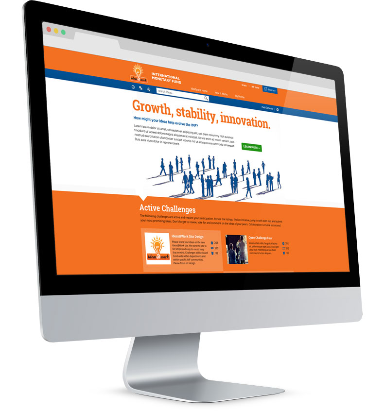
For the hero image I sought out a graphic that avoided obvious cliches such as a handshake. These silhouettes show an actual thriving, innovative workplace.

Ideas at Work homepage

A two-color palette exemplifies clarity.
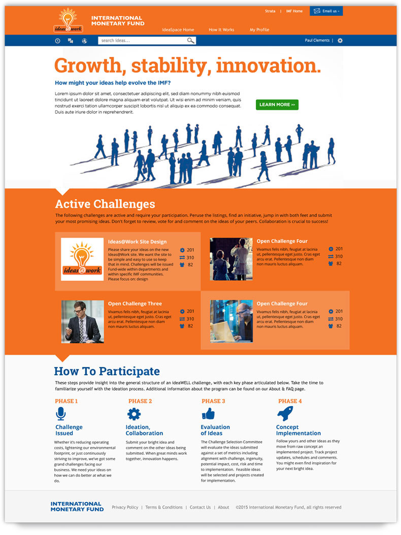
  • Challenge This homepage design is for a site developed by a third-party vendor that enables employees to suggest improvements in workflows and the office environment. We wouldn’t be able to change the underlying grid. We wanted to show that this was a progressive organization that welcomes change and encourages employees to contribute enhancements to procedures.
  • Solution We were able to graft on to this fixed grid a user interface with a custom palette, fonts, images, graphics, and content. I took a graphically oriented approach inspired by the flat design trend without simply mimicking the then-in-vogue movement. For the main image, I employed a striking monochrome silhouette image with long cast shadows that evoked connections and a common direction for employees. To reinforce a focus on action and clarity, I used a simple two-color palette, with a concordant but differently colored main call-to-action button to attract attention.
  • Result This was one of three comps I submitted for the project. The creative director’s opinion: “Excellent!”
Back to Portfolio