Outreach pocket folder

For a startup focusing on an innovative model for primary health care, I developed these concepts for a pocket folder.

Outreach folder 1

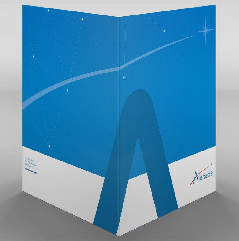
The company’s imagery, including the North Star and a stylized constellation, suggested that it was experienced and knowledgeable navigator confidently guiding its partners through uncertain seas.

Outreach folder 2

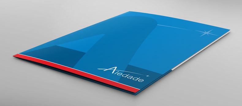
I removed the crossbar from the “A” but ensured it still reads clearly and confidently as part of the logo and brand.

Outreach folder 3

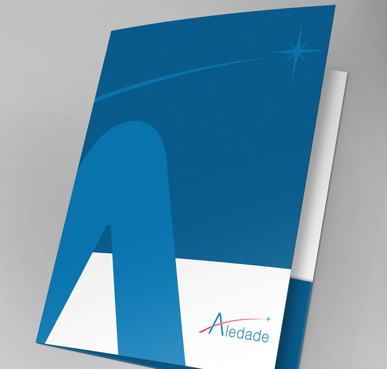
In each of these concepts, the star and logo draw users’ attention to the right of the cover—right where they open it up.

  • Challenge The company’s previous pocket folder centered a large logo vertically and horizontally on the front. That approach seemed a little formal for this energetic startup. Its outreach team was going out into the field to meet and pitch to potential partners who were used to operating independently and might be hesitant to committing to collaborating with a new partner. Much like a friendly but firm handshake, the folder needed to suggest the company was (a) approachable and easy to work with but also (b) highly skilled and results oriented.
  • Solution For my new concepts, I worked with scale, deconstructing the elements of the company’s logo. I created a giant “A” offset by the proportionally smaller star and swoosh. Adding in one of the company's signature design elements, a stylized constellation, I reassembled them in a way that suggested 3D space.
  • Result The resulting concepts drew on the brand guidelines I had just developed for the company and offered a real-world example of how designers could use these guidelines to solve a design challenge.
Back to Portfolio