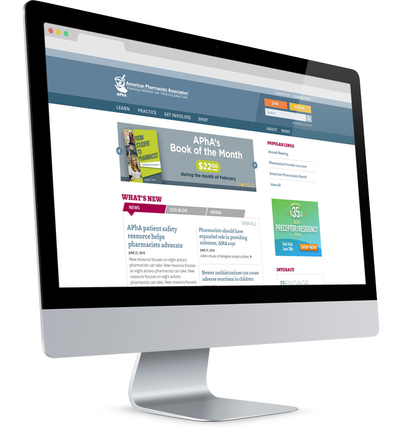
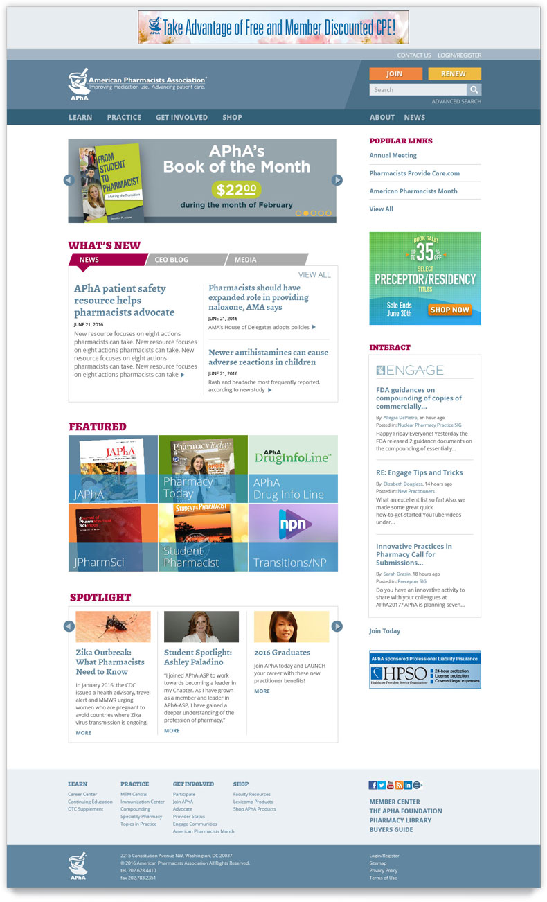
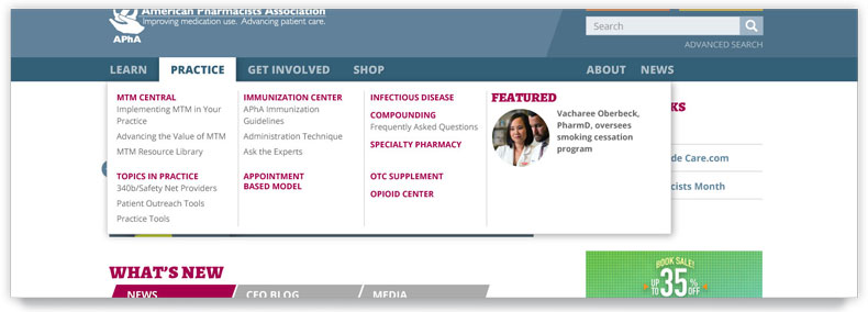
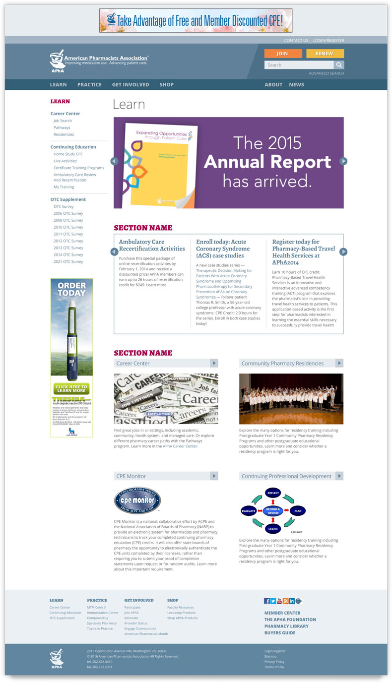
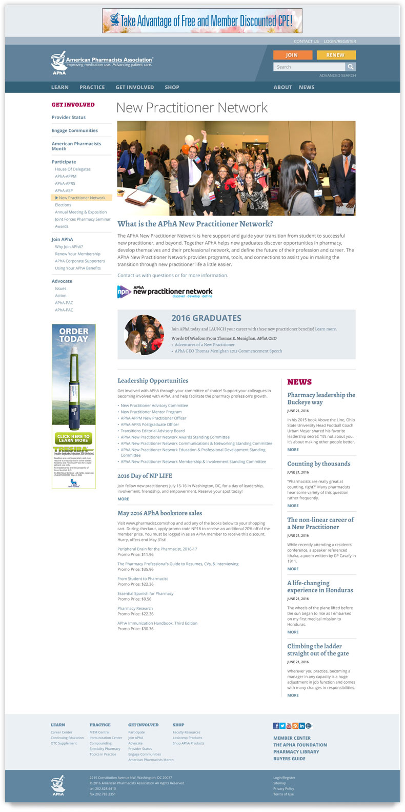
Challenge The association’s web team asked me to collaborate on a refresh of the entire site. They sought a visual approach that structured the pages and shifted the focus from decoration to content.
They wanted to streamline the design. On their own, they had experimented with removing the shaded background for the page. But they ran into an unexpected side effect: the page seemed less structured, and blocks floated on the page.
Other changes they requested involved the site’s usability and functionality. Analytics revealed that users weren’t clicking on the tabbed content in the main section—or even noticing that the tabs were there. The web team wanted to draw attention to the tabs.
Solution I researched the sites of the top 10 associations and other nonprofits, but I noticed that they focused primarily on marketing efforts and unchanging resources for members. The strength of this site was its wealth of useful, dynamic news, including vetted articles from the association’s publications.
So I shifted gears, looking instead at the websites of newspapers and magazines. I noticed their simplicity, timeless grayscale tone, and emphasis on spotlighting their strong content and avoiding distraction. To solve the floating content issue and structure the page, I drew on these news sites for inspiration and added understated gray rules around three of the content boxes.
I also researched best practices for tabs, particularly focusing on how to get users to notice them and by their appearance understand their function, a quality known as perceived affordance. I created skewed tabs, an unusual and attention-grabbing approach that I knew was easily achievable with CSS3’s “transform: skew” feature, which is well-supported by all contemporary browsers. I also added a triangle pointing from the tab to the content to enhance this perceived affordance.
To eliminate unintended distractions, I desaturated and streamlined the website’s palette, focusing on the blues and grays from the association’s logo. I reduced the size of the main navbar and changed it from purple to slate blue. For section headers, in lieu of large or extrabold type, I employed a saturated, warmer color.
I removed buttons where I could and replaced them with plain text links. My reasoning was that the two most critical buttons were the “Join” and “Renew” buttons at top left. I further emphasized these two buttons by giving them colors that were outside (but still concordant with) the palette.
I kept the existing site’s typeface, Open Sans, but added a contrasting serif typeface, Alegreya. This font is elegant, features many weights and a true italic, and is easy to read, even in small sizes and onscreen. While originally intended for literature, it has a newsy feeling reminiscent of print newspapers.
For the Featured section, which will highlight the association’s publications, I used translucent overlays with the publication’s name, atop an image of the publication or its logo.
